Sip Studio is a new-generation beverage brand focused on health-conscious Gen Z consumers. They approached us with a challenge: create a brand that feels fresh, expressive, and unapologetically fun — while still communicating their product’s natural, high-quality ingredients.
We built the brand around the idea of “sippable energy” — vibrant, spontaneous, and joyful. The color system is a mix of juicy gradients and high-contrast combos. The logotype is custom, bubbly, and playful, echoing the product’s fizzy personality.
The tone of voice was crafted to feel cheeky, quick, and real — short phrases with a wink (e.g., “sip happens”, “drink different”).
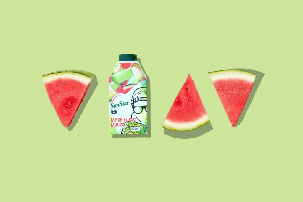
The cans are designed to be Instagram bait — bold illustrations wrap around the product, paired with funky typography and color-coded flavors. Each flavor has its own character, yet the system remains consistent and recognizable at a glance.
We extended the brand onto social: fast-moving templates, sticker-style icons, and motion elements to bring the fizz online. All assets were delivered in editable Figma & Canva formats for easy handoff to their team.
Within 2 months of launch, Sip Studio hit 30K+ followers on social organically and landed shelf space in 3 regional chains. The brand has since expanded its flavor line and plans to scale with influencers and digital campaigns.